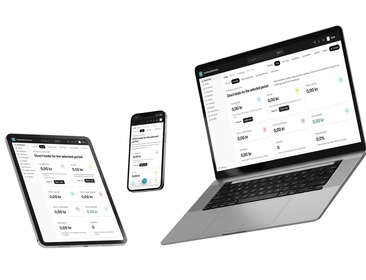
Desktop, tablet and phone, each designed on purpose
A page reflows on its own. When one device needs something different, switch to it and change it there: the other devices keep theirs.
Rooms from Rs 6,850 a night, lake view included
Order nowTablet · 2 overrides, grid 2 columns
Phone · 3 overrides, stack, image hidden
Desktop · base design, grid 3 columns
In short
Every layer has a desktop design plus optional tablet and phone overrides. Switch the breakpoint to Tablet or Phone, change any setting, and only that device changes; the inspector counts the overrides and Reset clears them. Show on devices hides a layer on the devices you choose.
The problem it solves
A layout that looks right on a laptop squeezes three columns onto a phone, and the only fix a template offers is to hide half the page.
How it works
4 steps, start to finish
-
1
Design on desktop
Build the section once; it reflows on smaller screens by itself.
-
2
Switch the breakpoint
Pick Tablet or Phone in the top bar, or look at each artboard with Alt 1, 2 and 3.
-
3
Override what differs
Change columns, spacing, sizes or text size; the inspector shows Editing phone and the number of overrides.
-
4
Hide or reset
Use Show on devices to hide a layer on a device, or Reset to drop that device's overrides.
In detail
What per-device design does for you
-
Three breakpoints
Desktop from 1,024 px, tablet from 640 px, phone below that.
-
Override, not copy
Tablet and phone store only what differs from desktop.
-
Show on devices
Hide a layer on phone without deleting it on desktop.
-
Counted
The inspector shows how many overrides a layer has on the device you are editing.
-
Any canvas size
Try portrait and landscape, or type a custom canvas size.
-
Ask for it
An assistant can make a section responsive over MCP, as a draft for you to check.
-
No. Design once; pages reflow by themselves. Override only where a device needs something different.
-
Desktop from 1,024 px wide, tablet from 640 to 1,023 px, and phone below 640 px, measured on the section itself.
-
Yes. Show on devices hides a layer on the devices you pick and leaves it on the rest.
Works together with
- A visual canvas with Layers, Elements, Pages, Popups and Global, not a template picker.
- Hover, pressed, focus, in view and scrolled states, and animations, without code.
- Wrap in a frame, make it a component, and give it variants you reuse.
- A store on your own domain, on the same catalogue, stock and orders as the counter.
Per-device design · Free to start
Try per-device design on your own business
Set up in a couple of minutes. Your catalogue, orders and books stay yours to export.
- Live in 2 minutes
- Free to start
- No credit card